Your typography could be the reason users leave before they even experience your product.
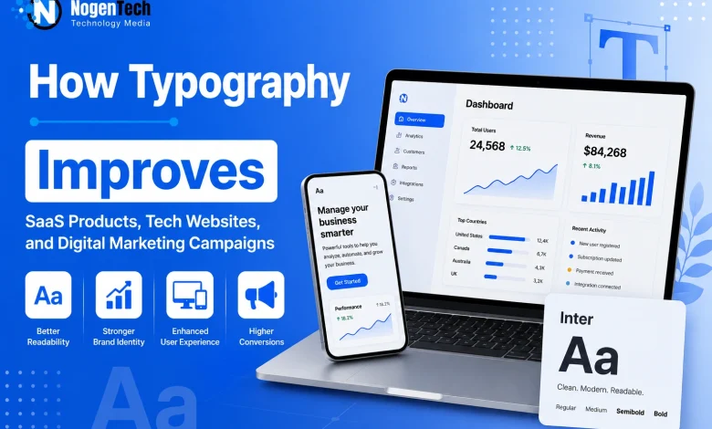
A tech product can have powerful features yet still feel difficult to use if its typography is weak. The right font system improves UX, readability, credibility, and user actions across:
- Dashboards
- Pricing pages
- Landing pages
- Onboarding flows
- Error messages
For SaaS companies, AI tools, tech blogs, ecommerce software, marketing platforms, and startup websites, typography is part of the interface, not decoration.
Choosing a typeface goes beyond style. It should perform consistently across product UI, mobile apps, documentation, help centers, email campaigns, pitch decks, ads, and customer dashboards.
Moving onward, you will explore practical font comparisons, common mistakes, licensing considerations, and best practices for SaaS products, tech websites, and digital marketing campaigns.
Quick Font Selection Table for Digital Products
| If You Are Building… | Start With… | Avoid… |
| MVP landing page | Free or open-source font | Decorative body fonts |
| SaaS dashboard | UI-focused sans serif | Weak hierarchy and tiny labels |
| AI product | Flexible sans, variable font, or modern AI-powered typography | Trendy fonts with poor readability |
| Developer tool | Sans serif plus monospace | Ambiguous code characters |
| Fintech product | Clear sans with strong numerals | Weak numbers and low contrast |
| Marketing campaign | Commercial display plus readable text | Style that hurts conversion |
| Enterprise platform | Commercial or custom type system | Fonts without app or web rights |
Why Does Typography Matter in SaaS Products and Tech Websites?
Typography improves SaaS products, tech websites, and digital marketing campaigns by making information easier to read, navigate, and act on.
A well-designed font system strengthens user experience (UX), accessibility, brand credibility, and conversion across dashboards, landing pages, and mobile apps.
Modern digital products combine data tables, pricing pages, onboarding flows, documentation, and CTAs within a single interface. An effective typography system helps:
- Improve readability across devices
- Create a clear visual hierarchy
- Build trust on pricing, signup, and checkout pages
- Simplify forms, onboarding, and error messages
- Support accessibility for diverse users
- Maintain brand consistency across products and marketing assets
- Increase engagement and conversion rates
For SaaS companies, typography is a usability asset that directly influences customer experience and business performance.
If you are outsourcing your build, make sure you know how to choose the right web design agency that understands these complex product requirements.
How Does Typography Improve Usability in SaaS Interfaces?
Typography creates a clear visual hierarchy in SaaS products and digital interfaces, helping users identify important information, prioritize actions, and navigate content more efficiently.
Consistent font sizes, weights, and spacing reduce cognitive effort, especially in information-rich products like project management software, CRM platforms, analytics dashboards, and fintech applications.
A well-designed typography system helps users quickly distinguish:
- Primary actions from secondary options
- Warnings from informational messages
- Headings from supporting content
- Metrics from descriptions
- Task priorities, labels, and status updates
Clear typographic hierarchy improves scanning, reduces errors, and helps users complete tasks faster.
How Do You Choose the Right Font for SaaS Products and Tech Websites?
You choose the right font that balances readability, accessibility, performance, multilingual support, and font licensing across SaaS products, tech websites, mobile apps, product UI, and marketing assets.
Which Fonts Work Best for Different Tech Products?
Every digital product has different typography requirements. Matching the typeface to the product improves usability, brand consistency, and user experience (UX).
| Use Case | Font Direction | Why It Works |
| SaaS dashboard | Neutral UI sans serif | Supports scanning, labels, filters, and data tables |
| AI product | Flexible sans serif or variable font | Feels modern while staying adaptable |
| Fintech app | Clear sans serif with strong numerals | Builds trust and reduces number-reading errors |
| Developer tool | Sans serif plus monospace | Separates interface text from code |
| Tech blog | Readable body font with strong headings | Improves long-form content performance |
| Startup landing page | Distinct but readable brand font | Helps differentiation without hurting clarity |
| Digital marketing campaign | Bold display plus readable text font | Captures attention while supporting conversion |
| Help center | Highly readable sans serif | Makes instructions easier to follow |
Use display fonts sparingly for marketing headlines, and prioritize highly readable fonts for dashboards, payment pages, security alerts, forms, and documentation.
What Should You Consider Before Choosing a Font?
Choose a typeface that supports both your users and business goals by evaluating:
- Font licensing for web, apps, ads, and PDFs
- Readability for interfaces and long-form content
- Content type, including dashboards, tables, charts, and code
- Consistency across product UI and marketing assets
- Multilingual support
- Mobile responsiveness
- Brand personality
How Should You Design Typography for SaaS Interfaces?
You should design SaaS typography to prioritize readability, hierarchy, and consistency to help users navigate interfaces and complete tasks faster.
For this, choose UI fonts that remain clear across dashboards, forms, data tables, and navigation, even in dense layouts.
What Should You Prioritize in SaaS Interfaces?
| Interface Element | Typography Priority | Common Risk |
|---|---|---|
| Navigation | Clear labels and spacing | Users miss key sections |
| Dashboard cards | Strong hierarchy | Metrics blend into descriptions |
| Data tables | Clear numerals and alignment | Users misread values |
| Forms | Readable labels and errors | Users enter incorrect information |
| Buttons | Direct, action-oriented text | Weak CTAs reduce engagement |
| Tooltips | Small-size legibility | Help text becomes difficult to read |
| Pricing pages | Clear numbers and plan names | Plans become harder to compare |
| Onboarding screens | Concise, friendly copy | Instructions overwhelm users |
How Should Typography Be Used on Marketing Websites?
Marketing typography should capture attention, build trust, and guide users toward conversions without sacrificing readability.
Unlike SaaS dashboards, landing pages are designed to persuade. Typography should emphasize key messages while keeping body text, CTAs, and supporting content easy to scan. Optimize typography for:
- Hero headlines
- Feature sections
- Pricing tables
- Customer testimonials
- Comparison tables
- FAQ sections
- Forms
- Sticky navigation
- Mobile CTAs
Fast, effortless reading improves engagement, trust, and conversion rates. If users struggle to understand the offer, the typography is reducing your page’s effectiveness.
Should You Choose Free, Open-Source, Commercial, or Custom Fonts?
Choose a font based on your product stage, budget, scalability, branding, and licensing, not just cost or appearance.
Every font type serves a different purpose. Here is a quick view for you to easily understand which font type is right for your product:
| Option | Best For | Advantages | Risks |
|---|---|---|---|
| Free fonts | MVPs, internal tools, early blogs | Low cost and quick setup | Overused, limited styles, unclear licensing |
| Open-source fonts | Developer tools, documentation, public products | Easy distribution, community support | Licensing still requires review |
| Commercial fonts | SaaS websites, apps, campaigns, brand systems | Larger font families, professional support, clear licensing | Higher cost and license management |
| Custom typefaces | Enterprise platforms, mature brands | Unique identity, tailored performance | Higher investment and longer development |
For most startups, a quality open-source or commercial font provides the best balance of usability, scalability, and brand consistency.
If you’re comparing professional typefaces, foundries such as TypeType offer commercial fonts, variable fonts, and extensive font families designed for product UI, branding, websites, mobile apps, and marketing campaigns,
As your product expands across websites, mobile apps, marketing assets, and design systems, a commercial or custom typeface becomes a stronger long-term investment.
If you’re evaluating professional font families, choose foundries that offer clear licensing, extensive font families, and support for commercial use across digital products.
How Should You Test a Font Before Launching?
Test fonts with real product content to ensure readability, consistency, and usability across every user touchpoint.
A font should perform consistently in the environments where users interact with your product. Before implementation, test it across:
- Dashboard labels
- Pricing tables
- Error messages
- Onboarding flows
- Blog content
- Chart labels
- Email subject lines
- Mobile buttons
- Help center articles
- Ad headlines
A typeface that looks great in a landing page headline may lose readability in tooltips, forms, or data-heavy dashboards. Always validate typography with real content before launching.
Why Is Font Licensing Important for SaaS Products and Tech Websites?
Font licensing protects your business by defining where and how a typeface can be used across digital products and marketing assets.
As SaaS products grow, typography extends beyond a website to mobile apps, landing pages, advertising, PDFs, videos, and brand assets. Each use case may require a different license, making font licensing essential for compliance, scalability, and long-term business growth.
What Font Licenses Should Businesses Check?
| License Area | Common Use Case | What to Verify |
|---|---|---|
| Desktop | Design files, mockups, presentations | Number of users or workstations |
| Webfont | Websites, blogs, SaaS landing pages | Domains, traffic, or usage limits |
| App | Mobile and desktop applications | App embedding rights |
| PDF / eBook | Whitepapers, guides, downloadable resources | Embedding permissions |
| Video | Product demos, webinars, advertisements | Video or broadcast rights |
| Server | Dynamic reports, invoices, generated content | Server-side rendering rights |
| Logo | Brand identity and wordmarks | Logo usage permissions |
| Modification | Customizing a typeface | Rights to modify or rename fonts |
When evaluating commercial fonts, choose foundries that provide transparent licensing for web, apps, branding, and marketing.
What Are the Most Common Font Licensing Mistakes?
Avoid these common mistakes:
- Using personal-use fonts in commercial projects
- Embedding desktop fonts on websites without a webfont license
- Using fonts in mobile apps without app rights
- Sharing font files with contractors without permission
- Including fonts in downloadable templates or assets
- Assuming every free font allows commercial use
- Modifying fonts without reviewing the EULA
- Failing to document font ownership and license details
Licensing issues often surface during funding, acquisitions, rebranding, or enterprise procurement, when compliance becomes part of due diligence.
How Should Teams Manage Font Licenses?
Teams should maintain a central record containing:
- Font name and version
- Foundry or source
- License agreement
- Purchase receipt
- Authorized users
- Approved domains
- App, PDF, and video rights
- Modification permissions
- Renewal or subscription details
Keeping licensing records organized helps design, development, marketing, and legal teams stay compliant as products grow.
What Can SaaS Companies Learn from Leading Brand Typefaces?
Leading brands use custom typefaces to improve consistency, usability, and brand recognition across digital products.
Not every SaaS company needs a custom font, but brands like Google, IBM, and Airbnb show how a consistent typography system strengthens both user experience (UX) and brand identity.
What Makes Google Sans Effective?
Google Sans uses variable font technology to maintain a consistent visual identity across UI, navigation, marketing assets, and information-rich interfaces.
This flexible typography system adapts across products without sacrificing consistency.
Why Is IBM Plex a Strong Typography System?
IBM Plex combines Sans, Serif, Mono, and Condensed styles to support everything from UI text and documentation to code snippets, data tables, and presentations.
This versatile font family creates consistency across different content types and platforms.
What Can Airbnb Cereal Teach About Brand Typography?
Airbnb Cereal creates a unified experience across search, booking, host tools, and marketing, making every customer touchpoint feel connected.
Consistent typography strengthens brand recognition while improving usability across digital products.
What Are the Most Common Typography Mistakes in Tech Products?
Here are some of the most common mistakes that you have to avoid:
- Choosing fonts based on trends instead of usability
- Using too many typefaces
- Making body text too small
- Creating weak visual hierarchy
- Using hard-to-read numerals in data tables
- Applying low contrast in charts and tables
- Ignoring mobile readability
- Using decorative fonts in UI labels
- Overlooking error messages and forms
- Missing multilingual character support
- Using unlicensed fonts in commercial projects
- Inconsistent typography across products and marketing assets
What Is the Biggest Typography Mistake?
Treating typography as decoration instead of a usability system is the biggest typography mistake.
A consistent typography system should support dashboards, documentation, landing pages, emails, and advertising. Inconsistent typography weakens user experience (UX), brand credibility, and conversions.
What Should You Check Before Finalizing Your Typography?
Review readability, consistency, licensing, and scalability before launching your product.
Before publishing or redesigning your SaaS product, tech website, or marketing campaign, confirm that your typography system:
- Can scale with your design system and future product growth
- Uses readable body text across desktop and mobile
- Maintains a clear visual hierarchy
- Displays numbers clearly in pricing tables and data tables
- Uses action-focused buttons and readable error messages
- Supports all required languages
- Remains consistent across product UI and marketing assets
- Includes the correct web, app, PDF, and commercial font licenses
Common Questions Answered About Typography for SaaS and Digital Products
What font size works best for SaaS dashboards?
Most SaaS dashboards use 14–16px for body text and 18–32px for headings. The ideal size depends on content density, screen size, and readability, but users should be able to scan tables, forms, and navigation without zooming.
Can the same font be used for both product UI and marketing?
Yes, many businesses use one font family across product UI, websites, and marketing assets to maintain brand consistency. Using multiple weights and styles within the same family creates visual variety without making the experience feel inconsistent.
Do variable fonts improve website performance?
Yes. Variable fonts combine multiple font weights and styles into a single file, reducing HTTP requests and improving performance while giving designers greater flexibility across responsive interfaces.
How many fonts should a SaaS website use?
Most SaaS products perform best with one primary font family and, if needed, one secondary font for display headings. Using too many typefaces creates visual inconsistency and increases maintenance.
What makes a font suitable for commercial SaaS products?
A suitable commercial font offers excellent readability, multiple weights, multilingual support, clear licensing, and consistent performance across websites, mobile apps, dashboards, documentation, and marketing campaigns.
My Final Thoughts on Choosing the Right Typography for SaaS Products
In my experience, the best typography decisions are driven by usability, not trends.
A well-planned font system improves user experience (UX), strengthens brand identity, and scales across SaaS products, tech websites, mobile apps, and digital marketing campaigns.
Whether you choose a free, commercial, or custom typeface, prioritize readability, accessibility, and clear licensing. Investing in the right typography today creates a more consistent product experience and supports long-term business growth.