
Analyzing User Experience (UX) is one of the important psychological techniques, and if you get it, you’ll be able to engage more and more users on your site. A user experience designer focuses on all aspects of web development, including design, layout, work, widgets, etc. He works to improve meaningful and to-the-point experiences for the users.
A huge number of users on a daily basis come across the digital world. It is necessary to catch their attention and get them to your website. If your site gives them a good experience, they’ll surely like it.
In reality, a single user experience mistake can cause discomfort for users, cause them to leave your website, and cause your company financial losses. Let’s discuss more about user experience mistakes and give tips on how to avoid them.
What is User Experience?
User Experience (UX) in the context of the web refers to how users feel when they interact with websites, web applications, and other online platforms. It basically consists of all aspects of the user’s journey and interaction. These are particularly aim to create a positive, efficient, and enjoyable experience.
There are multiple key aspects and elements which are genrally the fundamentals of a good experience. Some of the most important are;
- Usability: The product is easy to use and navigate.
- Accessibility: The product is useable for people of all abilities and disabilities.
- Aesthetics: The media is visually pleasing and have a consistent design.
- Functionality: The product performs its intended functions effectively.
- User Satisfaction: It meets the user’s needs and expectations.
- Loading Speed: Quick loading times are to keep users engaged and prevent frustration.
- Content Quality: It providies the relevant, well-organized, and easy-to-read content to meets user needs.
Common User Experience Mistakes to Avoid
Some of the common user experience mistakes are given below. You should avoid these to improve user experience on your site.
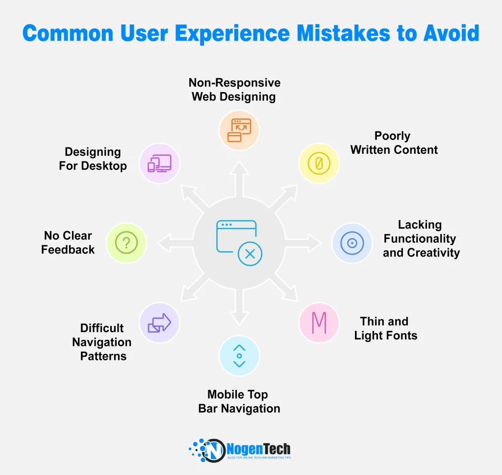
1. Non-Responsive Web Designing
One of the most common UX mistakes on the web is the non-responsive design on the home page and landing Pages. Many companies believe that they are doing well by hiring someone without experience and knowledge in web designing and management. This mistake leads to the website’s death.
An inexperienced web designer will damage your company’s reputation with bad UX. You’ll save money in a timely manner, but the consequences will be long-term deprivation from search engines. Don’t trust anybody further for the management of your website.
How to Avoid:
Hire a web designer expert who knows how to optimize the user’s experience. An expert web designer can create user experience design, good layouts, and attractive visuals for your website with the help of web design tools. According to Google, they’ll rank down non-responsive websites and rank up the responsive ones. You should go for usability testing on all of the targeted devices to rectify the issues on all devices.
2. Poorly Written Content
Contents are the main part of any website; they are the backbone of websites. Users search for reliable and authentic information. Every piece of content has great importance on the internet. In recent months, I have noticed that content structure and styling play vital roles in ranking.
How to Avoid?
For a better User experience, you should have rich content on your website and follow given common mistakes.
- Keyword Stuffing
- Grammar mistakes
- Post consistently
- Keep old content up-to-date
- No large Content
3. Lacking Functionality and Creativity
There should be relativity between your website’s creativity and functionality. Aesthetic aspects are necessary for better UX. However, there should be no compromise on functionality. When your website functionality is not enough to explore a web store or purchase a product, then how is it possible that you’ll generate better results?
How to Avoid?
Pure functionality with easy access to different menus will make your website popular among users. The functionality should include filters and sorting options. Creativity and functionality play crucial roles in achieving brand loyalty.
4. Thin and Light fonts
Thin and light fonts are accessible on different mobile apps and websites. Due to improved screen technology, many designers prefer these clean and attractive fonts. Inconsistent fonts also lead to poor UX.
These thin fonts cause usability problems and lose UX. Thin fonts are hard to read. Moreover, Not All viewers with different devices can see or read these words.
How to Avoid?
It is difficult to read thick and light fonts on iPhones and other iOS devices. To avoid UX mistakes, designers should use simple fonts available on all devices. Designers should invest time in specifying the fonts of the website.
5. Mobile Top Bar Navigation Design
Even if you are working with a professional audience that always uses the mobile application, you must work on mobile and replace top bar navigation with a slide in the menu. Another thing that compels viewers to leave the site is the difficulty of navigating the catalog. Almost half the audience for content comes from mobile phones.
How to Avoid?
The user is stuck in the menu and doesn’t know where to proceed next. It is a common user experience mistake, and it should be avoided; otherwise, it may harm the reputation of the site. One pro tip is to build elements in the bar that are responsive for all kind of devices.
6. Difficult Navigation Patterns
Before designing mobile navigation, take a look at the information you have developed. Having multiple categories and content lists without proper sequencing is a major hurdle to better UX. It should be created with the user knowledge – as everybody can not explore in the way we want.
How to Avoid?
You should have a clear image about, which category should appear first? Which pages are secondary or less important in the ranking? Try the steps people take most often and provide users with a quick and intuitive way to reach their goals.
7. No Clear Feedback on an Action
Users need clear and visible customer feedback whenever they add a product to the cart, rate something, copy a link, or unsubscribe from the list. Everything that other users leave for your site feedback should be visible to all.
Other members should also be able to post their comments. Not doing so will consequently confuse you, make you prefer additional customer service inquiries, and cause some users to stand against you.
How to Avoid?
A great option for better Feedback assessment is to use the feedback or survey tools. This will save a lot of your time and you do not have to build things from the scratch.
8. Designing for Desktop
Many companies have designed their websites only for desktop systems. More than sixty percent of website visitors are mobile users. They are exploring your websites on mobiles. If your website is designed for desktop and they want to proceed from mobile, they’ll surely have not proceeded, and it gives a weak user experience to the website.
How to Avoid?
The step is also aligned with the responsive design adaptation. However, it is specifically written here as it is the most common bug performed by the designers. So, designers create designs for all devices.
Final Thoughts
Achieving an outstanding user experience should always be a primary goal in website design and content creation. To maintain a positive image for your company and achieve commercial goals, a good place to start is to avoid common user experience mistakes.
After reading this article, you may be better able to highlight and avoid design and content errors. Always keep in mind the goal of your target audience and try to make the website a pleasure to experience.