What Is a Kagi Chart and What Is It Used For?

The Kagi chart was originally developed in Japan in the 1870s at the time the Japanese stock market began trading, and it was used to track the price movement of assets like rice, which was, and remains, a staple Japanese agricultural product. A Kagi chart, also known as a Kagi line chart, is a type of financial and technical chart used to indicate price changes of a security or other asset over time.
The Kagi chart is unique in that it does not use traditional time axes, instead of relying on a “ladder” of price changes. This makes it particularly well-suited for visualizing trends and changes in momentum.
Continue reading for a deeper look at Kagi charts and their role in stocks and securities.
Why are charts like the Kagi chart useful for monitoring the stock market?
There are a few reasons why charts are useful for monitoring the stock market. First, charts can help you to identify historical patterns in stock prices. This information can help you to make informed predictions about future stock prices. Second, charts can help you to monitor how stock prices are reacting to current events. This information can help you to make informed decisions about when to buy or sell stocks. Finally, charts can help you to track the performance of individual stocks. This information can help you to make informed investment decisions.
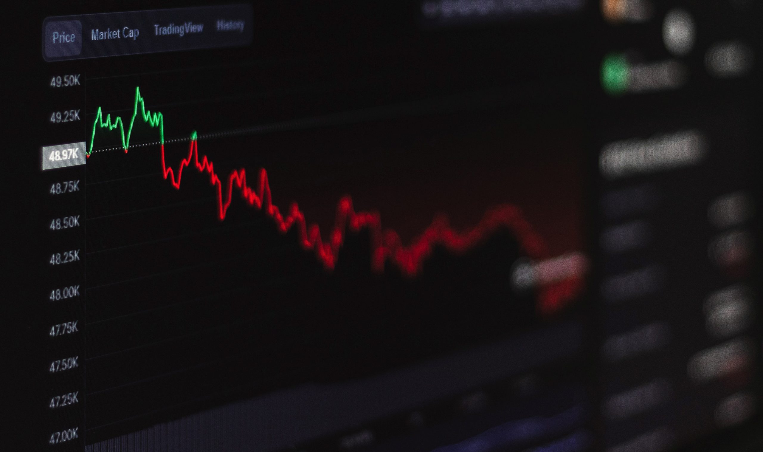
A Kagi chart is a financial chart used to track stock prices.
A financial chart is a type of diagram that shows how a particular financial metric changes over time. They can be used to track the performance of a company, an industry, or a specific investment. Financial charts can be used to help identify trends and make investment decisions. A Kagi chart is a type of financial chart used to track stock prices. It is similar to a line chart, but the lines are not connected. Instead, they are drawn in a zigzag pattern, following the stock’s price movement. This makes it easier to see when the stock has reached a peak or a valley. Kagi charts are used to predict future stock prices and plan investments.
Kagi charts can be very useful for predicting stock market trends, as they can help to show when a stock is starting to move in a particular direction. They can also help to identify when a stock has reached a support or resistance level, which can be helpful for making trading decisions.
A Kagi chart is a type of technical chart used to indicate the price movement of a security.
A technical chart is a graphical representation of price movement over time. Technical analysts use technical charts to identify trendlines, support and resistance levels, and other trading signals. A Kagi chart is a type of technical chart. It is similar to a candlestick chart, but instead of using a bar to represent the opening, high, low, and closing prices of a security, a Kagi chart uses a line. The line will move up or down to indicate whether the security is experiencing a rise or fall in price. The Kagi chart is calculated by taking the opening price and the closing price of a security and then dividing them by the high and low of the security.
Is it easy to make a Kagi chart?
Making a Kagi chart is not as difficult as it may seem. In fact, it is a relatively easy process that can be completed in a few simple steps. To get started, you will need to use a device like a laptop to create a chart with two axes. The vertical axis should be labeled “Price” and the horizontal axis should be labeled “Time.” Once you have created your chart, you can begin to add the data points. For each data point, you will need to know the price and the time. To add a data point, simply click on the chart and then enter the price and time. Repeat this process for each data point.
Once you have added all of the data points, you can begin to create the Kagi lines. To create a Kagi line, simply click and drag from one data point to the next. Once you have created all of the Kagi lines, you can begin to adjust the colors and styles. To do this, simply click on the chart, and then select the colors and styles that you want.
Overall, Kagi charts are relatively simple to make, and they’re an indispensable tool for navigating and monitoring the ins and outs of an ever-changing stock market.


