

We’re surrounded by data, charts in news articles, dashboards at work, and infographics on social media. Yet, not all visuals leave a lasting impression.
Why do some graphics grab our attention and inspire action, while others get ignored or misunderstood? The answer lies in how the data is presented. Powerful data visualization is both an art and a science.
It is the most critical strategy for industries and businesses to enhance their decision-making ability to survive in this highly competitive landscape. However, the process is not simple; you should follow essential tactics and strategies to perform this task.
I have developed this guide so that you can have the best idea about the techniques for effective data visualization.
What is Data Visualization?
Data visualization is a comprehensive process of using graphic representation to showcase information and reveal patterns, trends, and insights from complex data structures.
As a result, you can create charts, math graphs, and other elements to transform the data into an understandable and interpretable format. It helps in the effective communication of information, decision-making, and storytelling.
A strong visualization creates a bridge between raw data and human understanding to process information more efficiently than would be possible with text alone.
10 Best Techniques for Effective Data Visualization
In the under section, I have elaborated on the essential techniques to follow for effective data visualization and grab the associated advantages.
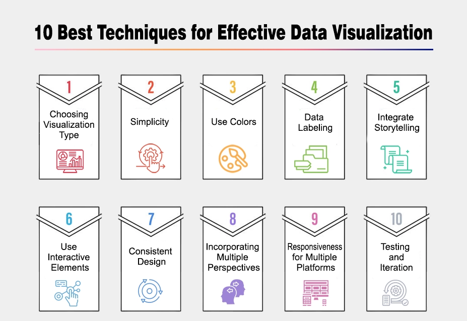
1. Choose the Right Visualization Type
Choosing the right visualization type is the most crucial process of effective data visualization. You must understand different types of effective visualization types so that you can grab the right chart for the correct information.
The foundation of effective visualization begins with choosing the right format for your data:
- Bar charts: Ideal for comparing quantities across categories
- Line charts: Perfect for showing trends and changes over time
- Scatter plots: Best for revealing relationships between variables
- Heat maps: Excellent for displaying density and concentration patterns
- Pie charts: Useful for showing proportional relationships (when used sparingly)
Understanding your data’s nature and your math graphs will guide you toward the most effective visual format.
2. Simplicity
Simplicity is the key to success in every industry. Therefore, you must try to bring it into your data visualization strategy to showcase the overall complex data in a more understandable and communicable format. As a result, users can easily understand them without any confusion.
Moreover, you can use labels to avoid unnecessary establishment and ensure the visual elements support. You must maintain a perfect balance between aesthetics and functionality so that data elements are entirely functional.
3. Use Colors
Colors are especially beneficial to differentiate between different elements and components. Therefore, you must choose the color parrot that is visually appealing and helps in conveying information by determining different segments of your database.
You can use contrasting colors to emphasize the accessibility of color-blind individuals. Make sure the consistency of color so that you can achieve a cohesive narrative for your data.
4. Data Labeling
Accurate data labeling is another fundamental aspect of effective data visualization. You must look for incorporated labels and make them clear, concise, and appropriately positioned to avoid cluttering.
Moreover, the annotation can help you provide additional context to outline the guidelines and highlight the essential observations you must make while processing the data. In this way, you can have your hands on the best and most desirable outcomes.
5. Integrate Storytelling
Storytelling is also crucial in this online and highly competitive landscape. Arrange your visualizations in a logical sequence to create a compelling narrative:
- Start with engaging headlines that capture attention
- Guide viewers through key insights progressively
- Conclude with clear summaries or calls to action
- Use transitions between related visualizations to maintain narrative flow
This storytelling approach maintains engagement and ensures smooth information flow.
6. Use Interactive Elements
Effective data visualization must incorporate interactive elements as they enhance engagement and allow users to explore the data on a wide basis.
Above all, you can utilize the potential of platforms like tooltips, filters, and other interactive charts to give the audience a deeper understanding of the information. However, it is necessary not to overwhelm the data with excessive interactivity, as it may cause overhead the actual facts.
7. Consistent Design
Consistency is also important to achieve success in this fast environment. Consistency in design elements establishes visual identity and builds trust:
- Standardize fonts, colors, and styles across visualizations
- Reinforce branding through visual choices
- Create visual hierarchies that remain consistent
- Develop reusable templates for recurring visualization needs
A consistent approach helps viewers focus on content rather than adjusting to changing formats.
8. Incorporating Multiple Perspectives
Using multiple visualization techniques and combining different chart types can help you highlight the various aspects of the data.
Also, this approach enables you to accommodate a diverse database to fulfill the requirements of a wider audience. This comprehensive approach accommodates diverse audience needs and provides more complete understanding.
9. Responsiveness for Multiple Platforms
Today’s audiences access information across various devices:
- Optimize visualizations for different screen sizes
- Test rendering on smartphones, tablet, and desktop displays
- Consider how interaction methods differ between touch and pointer devices
- Maintain consistent orientation and readability
Responsive design delivers a seamless experience regardless of how users access your visualization.
10. Testing and Iteration
Before deciding on a visualization type and finalizing it for your upcoming tasks, you should conduct a complete testing procedure to identify its potential benefits and down parts
Conduct A/B testing of different visualization approaches when possible and measure comprehension and retention to evaluate effectiveness
Final Verdicts
These are the details on the top ways and tips for effective data visualization. It is essential to follow and implement them precisely to have the best outcomes.
Otherwise, you will be unable to manage your data structure conveniently and grab the associated advantages like streamlined information flow and easy accessibility, resulting in not getting the desired outcomes.
Choosing the profile tools for data maintenance can help you accomplish your tasks swiftly and quickly. That’s why you must focus on implementing the tactics mentioned above.