The Email Accessibility Checklist That Also Improves Deliverability – What Developers and Marketers Miss in 2026

Email accessibility is often treated as a final compliance check: add alt text, verify contrast, and move on. But for developers and marketers, the same fixes can also make emails easier to read, interact with, and render reliably across different environments.
Accessibility is also only one part of responsible email operations. Practices such as GDPR compliance for email marketing govern how subscriber data is collected and used, while accessibility determines whether the resulting message can actually be understood and operated by more recipients.
In 2026, a useful email accessibility checklist should therefore go beyond compliance and show which technical fixes improve the quality and resilience of the message itself.
Why Accessibility and Email Performance Overlap
Accessibility problems often reveal weaknesses in the email itself.
An image-only promotion loses its message when images are blocked, poor contrast makes a CTA harder to read, and unclear link text creates friction whether or not the recipient uses assistive technology.
These are also useful considerations when comparing email marketing companies. Automation and analytics matter, but so do mobile responsiveness, campaign testing, deliverability controls, and the ability to catch quality issues before a message reaches subscribers.
The important distinction is that accessibility is not a documented Gmail ranking factor. It strengthens usability and email quality, while inbox placement still depends heavily on authentication, sender reputation, complaint rates, and sending practices.
The 2026 Email Accessibility Checklist
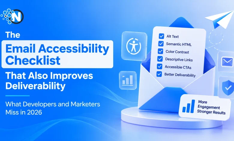
1. Give Informative Images Useful Alt Text
The W3C Web Content Accessibility Guidelines (WCAG) 2.2 require text alternatives for non-text content when appropriate.
Alt text should communicate the image’s purpose rather than describe its file type.
Instead of:
<img src=”chart.png” alt=”chart”>
use:
<img src=”chart.png”
alt=”Email conversions increased 18% in Q3″>
For decorative images, alt=”” prevents unnecessary descriptions from cluttering the screen-reader experience.
This also provides useful context when an email client or recipient blocks images.
2. Use Semantic Structure, Not Visual Shortcuts
A heading should describe hierarchy, not simply produce large text. Structure a campaign logically with <h1>, <h2>, and <h3> elements where appropriate, then control presentation separately.
The same principle applies to reading order. A multi-column layout may look correct visually while becoming confusing when interpreted sequentially by assistive technology.
Before sending, inspect the email without its styling. If the content order stops making sense, the underlying structure needs work.
3. Test Contrast Beyond the Main Body Copy
WCAG 2.2 specifies a minimum contrast ratio of 4.5:1 for normal text and 3:1 for large text at Level AA.
Do not check only paragraphs. Test CTA labels, footer text, promotional disclaimers, linked text, captions, and text placed over backgrounds.
Also, avoid using color as the only way to communicate information. An error, discount, link, or status should still make sense if its color difference is not perceived.
4. Make Links and CTAs Descriptive
Generic anchors such as “click here” lose meaning when a screen-reader user navigates between links.
Use:
<a href=”…”>Review the campaign report</a>
rather than:
<a href=”…”>Click here</a>
CTA copy should explain the resulting action. Buttons also need readable text, sufficient contrast, and enough visual separation from surrounding content.
5. Keep Essential Information as Live Text
Embedding the headline, price, deadline, and CTA inside one promotional image creates a fragile email. If that image is unavailable, most of the message disappears.
WCAG recommends using text rather than images of text when the same presentation can reasonably be achieved with actual text.
Keep critical offers, dates, product details, and calls to action in HTML whenever practical. This improves accessibility while making the campaign more resilient when images are suppressed.
6. Test the Rendered Message, Not Only Its HTML
Source-code validation is not enough because email clients modify and interpret HTML differently.
A useful pre-send test should answer four questions:
- Does the message remain understandable with images disabled?
- Does screen-reader reading order match the visual order?
- Can links and interactive elements be identified without relying on color?
- Does the layout remain readable on narrow mobile screens?
Testing the delivered output catches issues that are invisible inside the email builder.
.
What Accessibility Cannot Fix About Deliverability?
Accessibility improves the message recipients interact with; deliverability also depends on infrastructure and sender behavior.
Google’s current email sender guidelines require measures including SPF or DKIM for senders, while bulk senders have additional requirements, including
- SPF
- DKIM
- DMARC
- One-Click unsubscribe for applicable messages
Google also requires senders to keep reported spam rates below 0.3%.
Yahoo’s sender best practices similarly require authentication and low complaint rates, with additional DMARC and easy-unsubscribe requirements for bulk senders.
No amount of semantic HTML can compensate for a damaged sender reputation, unsolicited lists, missing authentication, or excessive complaints. Accessibility and deliverability belong in the same pre-send QA process, but they solve different failure modes.
Build Accessibility Into the Pre-Send Workflow
The practical shift for 2026 is to stop auditing accessibility only after a template is finished. Check alt text, hierarchy, contrast, live text, links, mobile behavior, and rendered output alongside the campaign’s other quality controls.
Teams that want to consolidate more of that review can use AlpacaRelay’s AI email readiness checker to analyze an email before sending and surface issues and suggested optimizations across deliverability, engagement, and compatibility.
The goal is not to claim that WCAG compliance unlocks the inbox.
It is to build emails that fail less often: messages that remain understandable when images disappear, readable under different viewing conditions, navigable with assistive technology, and technically sound when they reach the recipient.
In 2026, accessibility belongs in email engineering, not at the end of the compliance checklist.