Every iconic brand has a story, and TikTok is no exception. I remember researching on TikTok’s early branding and noticing how every color and curve of its logo was crafted to capture attention.
This design doesn’t just look appealing; it influences the TikTok algorithm, contributes to helping creators become popular on TikTok and gets more likes, views, and followers on TikTok.
Let’s explore TikTok’s logo history, its design evolution, and why it continues to draw millions worldwide and get everyone engaged with short-form content and even its TikTok Shop.
The Origins of the TikTok Logo and Brand Identity
TikTok, launched in 2016 by ByteDance, quickly became a global hub for short-form videos. Its logo is central to the app’s brand identity, remaining largely unchanged to ensure recognition and user familiarity worldwide.
What Does the TikTok Logo Mean?
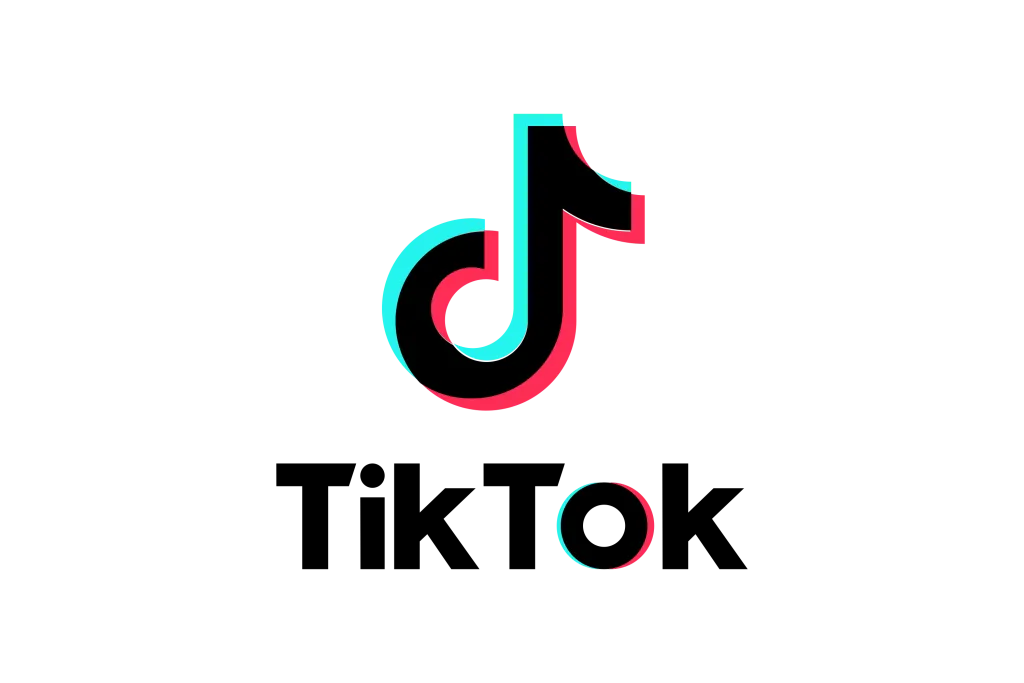
The logo reflects creativity, music, and digital entertainment. Its musical note highlights the app’s focus on music-driven content, while the neon blue, red, and white colors convey energy, excitement, and clarity. This design makes TikTok instantly recognizable as a symbol of global digital engagement.
Many brands use TikTok to get more views, likes, and sales, often using various marketing tactics for their TikTok shop and ad campaigns to reach audiences effectively.
Incredible History & Evolution of TikTok Logo
Here are complete details of the evolution of the TikTok Logo throughout history.
2016: Launch as Douyin
TikTok started as Douyin in China, created by Zhang Yiming under ByteDance. The original logo featured a stylized “D,” representing Douyin, with a neon design reflecting music and digital entertainment. At launch, it had 100 million users watching over 1 billion videos daily.
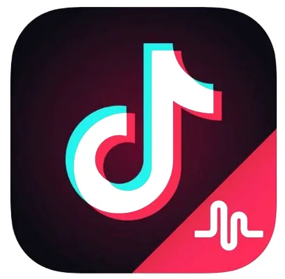
2017 – 2018: Musical.ly Merger & International Expansion
TikTok became the global platform when ByteDance acquired Musical.ly in 2017 for around $800 million to $1 billion.
While Musical.ly’s users and features were integrated, the app was rebranded as TikTok, unifying both user bases under one logo and identity.
In 2018, TikTok held the credit for the most downloaded apps and was a new trendsetter in different countries of the world.
Logo Changes:
- Black background with neon-colored musical note
- Minor outline adjustments to improve clarity
- Consistent font integration with the note icon
Impact:
- Established TikTok as a direct competitor to YouTube, Instagram, Facebook, and Snapchat.
- Unified Douyin and Musical.ly users under one logo
- Enhanced global brand recognition
2019: Integration with NFL
In 2019, TikTok partnered with organizations such as the NFL, hosting fan activities and official accounts. The logo remained consistent, emphasizing brand continuity. After that minor updates included:
- Slight modifications to note outline and gradient effects
- Change of color from white to black
- Optimization for merchandise, mobile apps, and promotional campaigns
How was the TikTok Logo Created?
The TikTok logo was designed by an anonymous artist inspired by neon concert lights. Its neon “D” shape reflects the platform’s original name, Douyin, and resembles a musical note.
The 2017 update improved clarity and digital readability a key part of ASO optimization. If TikTok focuses on this for its app, it shows how important it is to SEO-optimize your TikTok content as well.
Despite global trends of frequent redesigns, TikTok’s logo has remained mostly unchanged, symbolizing stability in a fast-growing social media platform.
Color Palette and Visual Psychology
TikTok uses a neon color palette with blue, red, and white on a black background.
| Color | Color Code | Meaning & Effect |
|---|---|---|
| Blue | #25F4EE | Trust, creativity, digital presence |
| Red | #FE2C55 | Energy, excitement, and engagement |
| White | #FFFFFF | Simplicity, clarity, and balance |
The neon musical note symbolizes music, creativity, and digital engagement, making the logo a universal representation of short-form entertainment
Font & Typography
The custom typeface complements the bold icon, with rounded edges for friendliness, optimized spacing for screens, and integration with the note icon.
This creates a cohesive logo that is instantly recognizable across apps, merchandise, and billboards, reinforcing global brand consistency.
Last TikTok Logo Creation
The TikTok logo was last refined in 2017 to enhance clarity, giving the musical note a purplish-blue outline and a sharper shape to attract viewers.
Since that till today, The company has kept the overall design unchanged, emphasizing consistency and relatability. More than just an icon, the logo symbolizes music and entertainment worldwide.
It plays a essential role in digital marketing, and brand identity, appearing on merchandise like hoodies, cups, and mugs. Its design has been key to making TikTok recognizable and popular across global audiences.
TikTok’s Logo Remains an Icon of Creativity and Engagement
The TikTok logo represents creativity, music, and global social media influence. Its consistent design, color palette, and iconic musical note make the platform instantly recognizable.
From Douyin’s launch to TikTok’s integration with Musical.ly and global partnerships, the logo has remained central to the platform’s identity. Through merchandise, global marketing, and app interfaces, it reinforces TikTok’s presence and cultural impact.
Its evolution shows how design, symbolism, and branding strategy drive the success of a global digital platform.
FAQs
When was TikTok’s logo created?
TikTok’s logo was created in 2016 when the platform was launched by the Chinese company ByteDance.
What does the TikTok logo represent?
The TikTok logo represents Douyin, the Chinese version of TikTok. It reflects the platform’s lively and creative atmosphere.
How did tiktok get its name?
The name TikTok reflects the short, rhythmic nature of the videos, similar to the ticking of a clock, emphasizing bite-sized, creative content
What is the inspiration behind the TikTok logo design?
The TikTok logo’s evolution since 2016 is inspired by the platform’s dynamic and creative nature.
What is the significance of musical note in the TikTok logo?
The colorful musical note in the TikTok logo adds to its appeal, symbolizing the platform’s association with music and creativity.
Can I use the TikTok logo for personal or commercial purposes?
The use of the TikTok logo is subject to the platform’s terms of use and branding guidelines. Refer to official TikTok resources for information on logo usage policies.