A slow website loses roughly 7% of conversions for every second of load delay. A confusing navigation structure drives visitors straight to competitors. A poor mobile experience means half your potential customers leave frustrated. These aren’t abstract statistics—they’re revenue walking out the door.
After 10 years of building websites for businesses across the UK and Ireland clients, I’ve seen the same preventable mistakes drain leads from otherwise solid businesses. The good news? Most web design problems have simple solutions that don’t require rebuilding from scratch.
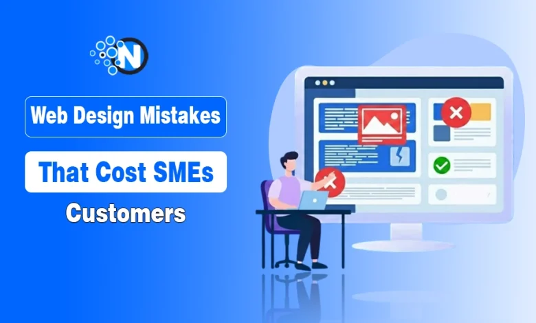
In this blog post, I have listed the major web design mistakes that kill conversions and how to fix them.
11 Web Design Mistakes in SME Websites
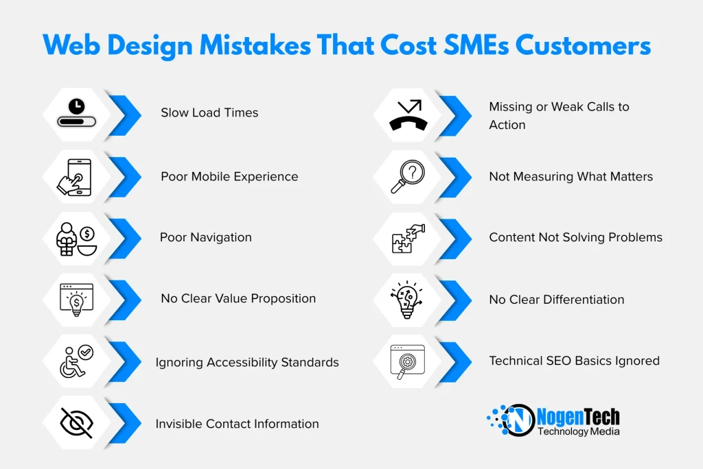
1. Slow Load Times: The Silent Revenue Killer
Your website’s speed directly impacts whether visitors become customers. Google’s research consistently shows that probability of bounce increases 32% when page load time goes from 1 to 3 seconds. At 5 seconds, that probability jumps to 90%.
Yet most SME websites still load in 4-6 seconds on mobile. That’s not a minor inconvenience—it’s a business problem.
What causes slowdown:
- Uncompressed images (often the biggest culprit)
- Too many plugins or scripts running simultaneously
- Cheap hosting that can’t handle traffic spikes
- No caching strategy
- Render-blocking JavaScript and CSS
Practical fixes:
Compress images before uploading using tools like TinyPNG or ShortPixel. Most photos can be reduced 60-80% without visible quality loss. For WordPress sites, enable caching through a plugin like WP Rocket or W3 Total Cache. Consider a CDN (Content Delivery Network) if you serve customers across multiple regions.
Run your homepage through Google PageSpeed Insights monthly. Aim for 90+ on mobile—anything below 50 needs immediate attention.
2. Mobile Experience Treated as an Afterthought
More than 60% of web traffic now comes from mobile devices, yet many businesses still design for desktop first and hope mobile “just works.” It rarely does.
Common mobile problems include:
- Text too small to read without zooming
- Buttons positioned too close together for thumb tapping
- Forms that require horizontal scrolling
- Images that extend beyond screen width
- Pop-ups that cover the entire mobile screen
The fix isn’t simply making things smaller. Mobile-first design means considering how people actually use phones: one hand, thumb navigation, interrupted attention, slower connections.
Priority mobile improvements:
- Minimum 16px font size for body text (14px is unreadable on most phones)
- Tap targets at least 44×44 pixels with adequate spacing
- Simplified navigation that doesn’t require multiple taps to find key pages
- Click-to-call phone numbers and maps that open in apps
- Forms with appropriate input types (email keyboard for email fields, number pad for phone fields)
Test on real devices, not just browser emulators. The experience differs significantly.
3. Navigation That Makes Visitors Work Too Hard
If someone lands on your website and can’t find what they need within 10 seconds, they leave. Simple as that.
Poor navigation manifests in several ways:
- Too many top-level menu items (7+ creates cognitive overload)
- Clever or branded labels instead of clear descriptions
- Important pages buried three clicks deep
- No search function on content-heavy sites
- Footer-only contact information
Your navigation should reflect how customers think about their problems, not how your business is internally structured. “Solutions” means nothing to a visitor. “Web Design for Restaurants” tells them exactly whether you can help.
Navigation audit questions:
- Can someone find your contact page in under 3 seconds?
- Are your core services visible without clicking anything?
- Does your menu make sense to someone who’s never heard of your business?
- Is the navigation consistent across all pages?
Consider user experience testing with people unfamiliar with your industry. Their confusion reveals problems you’ve become blind to.
4. No Clear Value Proposition Above the Fold
Visitors decide within 3-5 seconds whether to stay or leave. That decision happens based on what they see immediately—before any scrolling.
Too many websites waste this premium real estate on:
- Generic stock photos that could represent any business
- Vague statements like “We provide solutions” or “Quality service since 2005”
- Sliders that cycle through multiple messages (research shows these are largely ignored)
- Large logos that consume valuable space
Your above-the-fold content should answer three questions instantly:
- What do you do?
- Who do you do it for?
- Why should I choose you over competitors?
Effective headline formula: [Specific service] for [specific audience] in [specific location/industry]
“WordPress Web Design for Professional Services Firms in Belfast” tells visitors exactly what they need to know. “Welcome to Our Website” tells them nothing.
5. Ignoring Accessibility Standards
Web accessibility isn’t just about compliance—though the European Accessibility Act requirements coming in 2025 make compliance increasingly mandatory. Accessible design improves experience for everyone.
Consider that:
- 15% of the global population has some form of disability
- Ageing populations mean increasing numbers of users with vision, hearing, or motor difficulties
- Accessibility features often benefit all users (captions help people watching without sound, keyboard navigation helps power users)
Common accessibility failures:
- Insufficient colour contrast between text and background
- Images without alternative text descriptions
- Videos without captions or transcripts
- Forms without proper labels
- Content that only works with a mouse, not keyboard
ProfileTree’s web design services include accessibility auditing as standard because we’ve seen too many businesses face legal exposure or simply lose customers through inaccessible sites.
Quick accessibility wins:
- Run your site through WAVE (Web Accessibility Evaluation Tool)
- Ensure colour contrast ratios meet WCAG AA standards (4.5:1 minimum for body text)
- Add descriptive alt text to every informative image
- Test navigation using only keyboard (Tab, Enter, Escape)
- Provide transcripts for video and audio content
6. Contact Information That’s Difficult to Find
This sounds basic, yet I regularly audit sites where finding contact details requires scrolling through multiple pages. Every barrier between the visitor and reaching you costs leads.
Essential contact elements:
- Phone number visible in header (click-to-call on mobile)
- Contact page accessible from main navigation
- Physical address if you serve local customers
- Multiple contact options (phone, email, form)
- Expected response time (“We typically reply within 4 hours”)
For service businesses especially, make the phone number prominent. Many customers—particularly for urgent needs—prefer calling over filling forms.
Contact page improvements:
- Include a map for physical locations
- List specific people for different enquiry types where appropriate
- Set expectations for response times
- Provide alternative methods (phone, email, social, chat)
- Consider a simple contact form that doesn’t require 15 fields
7. Missing or Weak Calls to Action
Every page should guide visitors toward a specific action. Without clear direction, people browse passively and leave without converting.
Weak CTAs:
- “Submit” (tells user nothing about what happens next)
- “Click Here” (meaningless without context)
- Generic “Learn More” on every page
- CTAs buried at page bottom only
- No CTA at all
Effective CTAs:
- “Get Your Free Website Audit”
- “Book a 15-Minute Discovery Call”
- “Download Our Web Design Checklist”
- “Request Your Quote Today”
Place primary CTAs above the fold and repeat them at logical points throughout longer pages. Use contrasting colours that stand out from your design scheme.
CTA testing approach: Test different button text, colours, and placements. Small changes often produce significant conversion differences. “Get Started” might outperform “Sign Up” by 30% or more for your specific audience.
8. Not Measuring What Matters
You can’t improve what you don’t measure. Many SME websites have Google Analytics installed but nobody actually reviews the data.
Key metrics to track:
- Bounce rate by page (which pages lose visitors immediately?)
- Conversion rate (what percentage of visitors take desired actions?)
- Traffic sources (where do your best customers come from?)
- Page load time (is speed degrading over time?)
- Mobile vs desktop performance (does mobile convert differently?)
Set up goals in Google Analytics to track form submissions, phone clicks, and other key actions. Review monthly at minimum.
Understanding that digital skills gaps often prevent SME owners from making sense of their analytics, Future Business Academy offers practical training on interpreting website data and making evidence-based improvements.
9. Content That Talks About You Instead of Solving Problems
The most common content mistake: writing extensively about your business history, team, awards, and capabilities while barely addressing what customers actually need to know.
Visitors don’t care about your company—at least not initially. They care about their problems and whether you can solve them.
Customer-focused content approach:
- Lead with the problem your service solves
- Explain your approach and what makes it effective
- Provide evidence through case studies and results
- Address common objections and concerns
- Only then introduce your company and team
Your About page should still highlight credentials and experience, but even there, frame everything in terms of how it benefits customers.
10. No Clear Differentiation From Competitors
If your website could belong to any competitor with minimal changes, you have a differentiation problem.
Too many service business websites include:
- Generic stock photos used across the industry
- Identical service descriptions
- Similar claims about quality and service
- No specific examples or unique processes
- Nothing that couldn’t be copied in five minutes
Your website should answer: “Why should I choose you over the dozens of other businesses offering similar services?”
Differentiation elements:
- Specific case studies with measurable results
- Your unique process or methodology
- Genuine team photos and personalities
- Client testimonials that mention specific benefits
- Clear statement of who you’re ideal for (and who you’re not)
Being specific sometimes means acknowledging you’re not right for everyone—and that’s valuable. A web design agency specialising in dental practices isn’t for everyone, but dentists searching for help will find that specificity compelling.
11. Technical SEO Basics Ignored
Beautiful design means nothing if search engines can’t properly index your site. Technical SEO problems often hide beneath the surface.
Common technical issues:
- Missing or duplicate meta titles and descriptions
- No XML sitemap submitted to search engines
- Broken internal and external links
- Missing canonical tags creating duplicate content issues
- Slow server response time
- No SSL certificate (HTTPS)
- Improper heading hierarchy (H1, H2, H3 structure)
Run a technical audit using tools like Screaming Frog or Sitebulb. Fix critical issues first (broken links, missing SSL, duplicate content), then work through warnings systematically.
Transform Your Site into a Conversion Engine Now
Web design mistakes aren’t character flaws—they’re fixable problems. Start with whatever’s causing the most friction: usually speed, mobile experience, or unclear navigation.
Make one meaningful improvement each month. Measure the impact. Build from there.
The businesses that succeed online aren’t necessarily those with the biggest budgets or flashiest designs. They’re the ones that systematically remove barriers between customers and conversion, then keep refining based on real data.
Frequently Asked Questions
Quick wins (image compression, CTA updates) take just a few days. Major structural overhauls or accessibility compliance typically require 2–8 weeks, depending on complexity.
Start with high-impact patches (speed and mobile usability). If the underlying tech or structure is still failing, a full redesign is often more cost-effective than constant patching.
Treating a website as a static project rather than a living asset. Websites require ongoing maintenance, security updates, and performance monitoring to stay effective.
Check your data: high bounce rates or a conversion rate below 2–5% are red flags. If mobile users convert less than desktop users, your mobile experience is likely the culprit.
es. Google explicitly ranks sites based on user experience, including page speed, mobile-friendliness, and technical structure.
Expect to invest between £3,000 and £15,000. Prices below this often lead to technical shortcuts, while higher prices should include custom functionality or advanced strategy.