
In the early years, HTML Tables were the main tool used in the early days of web development to create layouts. They provide a simple method for organizing content on web pages. For developers who wanted more control than plain text and basic formatting allowed, tables were the obvious choice.
But as the internet matured, so did user expectations. Websites needed to load faster, adapt to different devices, and remain accessible for everyone, including people using assistive technologies. Tables, once the hero of early web design, quickly showed their weaknesses.
Divs and CSS are used in web development these days to design layouts that are adaptable, responsive, and user-friendly. This article explains how divs, CSS, Flexbox, and Grid replaced tables to revolutionize web design.
Why Tables Were Once Popular
In the 1990s and early 2000s, tables offered developers the ability to:
- Arrange content into rows and columns.
- Create multi-column websites with headers, sidebars, and footers.
- Maintain predictable designs across browsers that lacked consistent CSS support.
A common structure can include a three-column table, navigation on the left, content in the middle, and ads or extras on the right.
At the time, tables felt practical and reliable. But as the internet grew more dynamic, its limitations became clear.
The Limitations of Table-Based Layouts
- Semantic Issues: Tables mix content with presentation. HTML’s role is to describe meaning (like headings, paragraphs, or data), not to dictate appearance. Using tables for design clutters code and reduces semantic clarity.
- Accessibility Problems: Table-based layouts can cause accessibility issues for assistive technology such as screen readers. Do not use tables to organize a webpage; they can confuse people who rely on them for tabular information.
- Poor Responsiveness: Tables struggle to adjust to various screen sizes. On mobile devices, they can cause webpages to appear cluttered and difficult to navigate.
- Maintenance Difficulties: Modifying a table-based layout frequently requires extensive redesign, which can be expensive and prone to mistakes.
- SEO Drawbacks: Search engines prefer clean, semantic HTML. Table-heavy layouts dilute meaning, which can negatively affect rankings.
The Rise of Divs and CSS
The shift from tables to divs and CSS marked a turning point in web development.
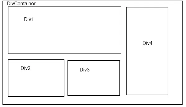
- Divs: Generic container elements that group content logically.
- CSS: A stylesheet language that controls presentation, colors, spacing, positioning, and responsiveness.
Separating structure (HTML) from style (CSS) allowed developers to write cleaner code while maintaining greater control over design.
Modern workflows have gone further. Tools like Figma to HTML converters now bridge design and code, helping teams move from mockups to live, responsive layouts faster than ever.
Advantages of Using Divs and CSS
- Separation of Concerns: Developers can divide a webpage’s presentation from its structure using divs. The code is more legible, maintainable, and scalable as a result of this division.
- Enhanced Accessibility: Contemporary CSS and div layout methods make layouts more accessible. The user experience can be improved by screen readers and other assistive devices, which can better interpret and navigate web pages.
- Flexibility and Responsiveness: CSS has robust layout modules, such as Grid and Flexbox, that let designers construct designs that are both responsive and adaptable. The way these layouts work on various screen sizes is fluid and enhances the mobile user experience.
- Easier Maintenance: Using divs and CSS makes it easier to update and adjust layouts. Stylesheet modifications can be made without affecting the HTML structure, which lowers the possibility of mistakes and saves time.
Flexbox: A Game Changer in Modern Layouts
Flexbox, a CSS layout concept, creates a more effective way to align and distribute space among elements in a container. It is a vital tool for modern web development since it is excellent at producing responsive, adaptable layouts.
Important Flexbox Features
- Flex Items and Containers: A flexbox is made up of flex items and flex containers. The items are the ordered and aligned elements inside the container, while the container defines the layout’s context.
- Alignment and Direction: Flexbox gives developers the ability to define the alignment and direction of items along the main and cross axes as well as the layout’s direction (row or column). This adaptability makes the task of designing intricate patterns easier.
- Space Distribution: To manage the space between and surrounding objects, Flexbox offers characteristics like justify-content and align-items. This feature comes in especially handy when making designs that are responsive to various screen sizes.
- Order and Flexibility: Flexbox gives developers the ability to modify an item’s order as well as how flexible it is inside the container. This feature enables dynamic layouts that adjust to different content and screen configurations.
CSS Grid Layout: The Next Level
Although Flexbox works well for one-dimensional layouts, CSS Grid Layout offers a two-dimensional layout approach that elevates web design to a new level. Grid Layout is perfect for building intricate and responsive web designs because it provides fine control over both rows and columns.
Essential Elements of CSS Grid Layout
- Grid Containers and Items: Grid Layout is made up of grid containers and grid items, just as Flexbox. The objects positioned inside the grid are called items, and the container establishes the grid context.
- Two-Dimensional Control: Grid Layout gives programmers the ability to specify rows and columns, giving them exact control over elemental arrangement. When making complex layouts, this capability comes in handy.
- Template Areas and Lines: Grid Layout presents the notion of template areas and lines in a grid layout. Within the grid, developers can create named zones and use these names to position things in particular spots. This method makes the process of creating intricate layouts simpler.
- Responsive Design: Grid Layout facilitates responsive design by giving developers the ability to specify distinct grid layouts for a range of screen widths. This feature guarantees that websites display well across all platforms.
The Benefits of Modern Layout Techniques
There are many benefits of using modern layout principles in web development:
- Cleaner Code: Semantically organized code that is simpler to read and update is encouraged by divs and CSS.
- Enhanced Accessibility: By simplifying the interpretation and navigation of web content for assistive technologies, modern design improved accessibility.
- Responsive Design: With responsive design, developers may make designs that effectively adjust to various screen sizes, enhancing the user experience across all platforms. Flexbox and Grid Layout are two examples of this technique.
- Increased Flexibility: More imaginative and dynamic designs are possible thanks to the increased flexibility that modern layout techniques offer in terms of element arrangement and alignment.
- Easier Maintenance: Maintenance is made easier when structure and presentation are kept apart. This reduces the possibility of mistakes and saves time when updates and alterations are made.
Final Words
Significant advances in web development can be seen in the switch from tables to divs and the use of contemporary CSS methods like Flexbox and Grid Layout. These techniques guarantee responsive design, improve accessibility, and encourage clear, semantic coding.
With modern strategies, developers can build websites that are visually appealing, easy to maintain, adaptable, and accessible. These essential tools and techniques gives you a strong edge in the ever-evolving world of web development.