Amazon logo is the trademark identity of this top-quality e-commerce platform, representing its services and products alongside its values, culture, and mission. Over the years, this logo has experienced significant changes, evolving from a simple symbol to the world’s most recognizable logo. Since 1994, the developers have continued to change their design to reach the best one currently represented on the website. Most people are looking for this exceptional sign’s complete history and meaning. If you are also one of them, you are in the right place, as we have detailed all the information in this guide.
Amazon Logo – An intro
The current Amazon logo was launched by Amazon in 2013 and features the company’s name with “a” and the curved arrow underneath it. Besides just a simple symbol, it delivers a comprehensive message as the arrow starts from “a” of “Amazon” and ends at “z.” Thus, it showcases that Amazon provides you with everything with names starting from A to Z. Moreover, the curved arrow delivers a smiley look, guaranteeing customer satisfaction and the joy of shopping. Hence, you can get all the details about the world’s largest dropshipping platform just by looking at its symbol. Above all, the logo represents the customer-centric approach and comprehensive range visibility of products and services.
History of Amazon Logo:
In the under-section, we have enlisted the details regarding the history of the Amazon logo and its evolution over the years.
1 – The Original Logo
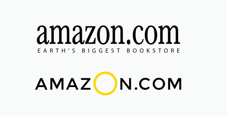
Amazon logo launched initially in 1994 when Jeff Bezos started it as an online bookstore. At that time, no one had imagined that this small startup was soon going to become the world’s largest e-commerce giant. Owing to the great ambition of the founder, the first logo depicts the humbleness of its roots. In 1995, the first-ever Amazon logo was made public in a simple, unassuming font.
The original Amazon logo didn’t showcase any imagery or symbolism because the platform only provided books and ideas for the digital store. Thus, it is designed with simplicity and effectiveness in consideration. Moreover, it also depicts the view of the simple and digital bookstore. Above all, this minimalistic approach was typical of web design aesthetics in the mid-90s.
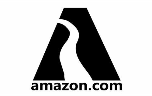
2 – The Zebra Print Logo
The Zebra print logo is one of the most iconic logos that came to the foundation in 1997. It covered all the necessary aspects as Amazon has expanded its offerings beyond books. The company needs a more dynamic and versatile Amazon logo to resonate with the services. It featured the name of this top e-commerce giant along with the alphabet “A” above the company’s complete name. Hence, this logo provides a multifaceted symbolism.

The two main components of this Amazon logo are the Zebra print form of A and the company’s complete name. The zebra prints above the company name represent customer satisfaction and their positive behavior toward the brand. Similarly, when it is taken as the river, it means the Amazon River, after which the company was named. The primary purpose is to showcase that the company flows into various markets like a river.
3 – Amazon Logo 1998
In 1998, the launch of the world’s largest search engine, Google, changed the whole scenario of the digital world. It provides a way for digital geeks to come up with their websites and digital platforms to deliver products and services online. Similarly, the evolution of Amazon started in 1998, and the developers worked extensively to scale its growth to a worldwide level, making it the best way to earn money. The Amazon logo faced numerous changes in the same year to represent its exclusive features.
Amazon designers have launched 3 different types of logos within the same year to cover all the aspects of this large e-commerce platform. However, all of them failed to impress the users for their annoying representation and extreme simplicity. The first one was to depict the bookstore only. However, later ones are pretty good at covering other products. But soon, their shape and other features become the reasons for their rejection.
4 – The Smile Logo

After testing multiple logos in the late 90s, the Amazon logo came up with the Smile in 2000. One of the most famous design industries, Turner Duckworth, collaborated with this large dropshipping giant to create this outstanding logo. The curved line in the logo showcases multiple terminologies and methods. Moreover, it creates different layers of meanings, as described in the under-section.
- Direction and Progress: The forward-pointed arrow represents that the company aims to move in the upgraded direction to meet all the customers’ requirements and demands.
- Customer-Centricity: The arrow also forms a subtle smile to showcase that buyers are extremely satisfied and have an ultimate joy of experience.
- A to Z: Another meaning is represented by the length of the arrow as it starts from A and ends at Z of Amazon, depicting that you will get all the products on this e-commerce platform.
5 – The Smile Returns
As the world gets increasingly digital, Amazon has worked to deliver the best experience to its customers, and the Amazon logo is no exception. In 2013, the developers made some critical changes to the symbol, making it more crisp and bold. Further, they have enhanced the colors, making it the best logo ever designed for the company. Above all, the orange and black combo represents the credibility and effectiveness of the logo.

Amazon Logo and Its Implications for Service Representations
After the complete evolution of the Amazon logo, the developers have designed different symbols to showcase different services. We have detailed all of them in the following section.
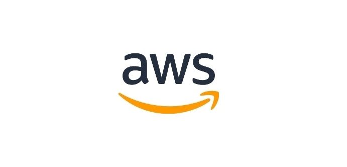
AWS
Amazon Web Services is one of the top-tier productivity tools to carry out some necessary functions and deliver the best responses to customers. The designers have designed this logo by keeping the relation between the parent company and this productivity tool to represent their close connection. The whole symbol consists of the AWS written above the curved line. The name represents the tool, while the line underneath has the same meaning as the Smiley logo. It is because AWS has provided users with exceptional advantages.
Amazon Prime
Amazon Prime is the world’s largest video streaming platform, providing access to a more extensive library of TV shows, films, dramas, and movies. Worked on a subscription basis, it exhibits a more extensive customer base. While this video streamlining platform’s logo retains the core element of the original Amazon logo, several changes have been seen in the structure and colors. Among the significant alterations is that Prime has replaced the word Amazon. Moreover, the distinctive Blue color comes in the place of Orange. The icon remains the same, depicting the power of the brand symbol.

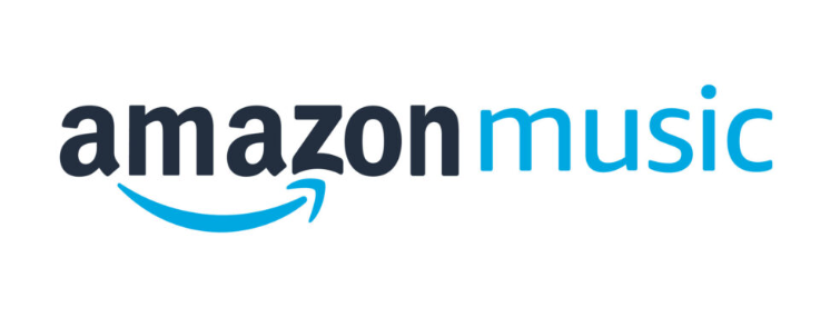
Amazon Music
Similar to Prime, Amazon Music is also the product of the world’s largest e-commerce platform to showcase the power of songs and music of every genre and language. Whether you love pop or jazz music, you will have something according to your interest on this platform. The logo of this service also resonates around the primary elements, with Music added after the current symbol. The curved line is in blue to exhibit trust and credibility. Moreover, it starts from A and ends at Z with the same meaning.
Amazon Kindle
Amazon Kindle has also influenced the world’s population in an engaging style by providing a convenient source to purchase and read books digitally. Users can buy their favorite books and order the paperbacks for a physical reading experience. The Amazon logo is featured similarly to the primary logo, with Kindle written in the yellowish-orange color after it. Thus, retaining the core elements shows a deeper connection with the world’s largest e-commerce platform. Further, the curved smiley line showcases customer satisfaction.

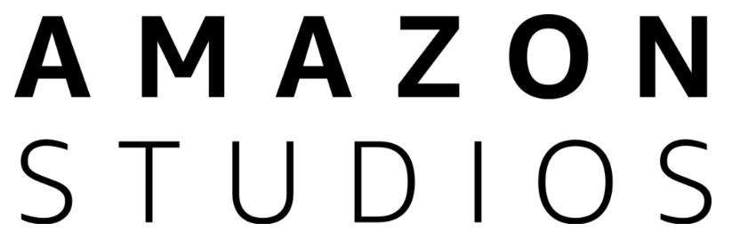
Amazon Studios
Amazon Studios exhibits a greater deviation from the original Amazon logo than the others. It features the white logo fonts in a cinematic style, and all the letters are in caps. Further, the contrast with the dark background looks more elegant and eye-catching. However, there is a specific reason behind the removal of core elements from its logo. One significant reason is that Amazon Studios deviates from the main values as it involves shooting and recording videos and songs instead of providing the services and other values.
Final Verdict:
The Amazon logo has transformed from a simple text-based design to a globally recognized symbol in nearly three decades. It represents much more than an online marketplace. Each logo evolution tells a story of Amazon’s commitment to customer happiness and unwavering dedication to progress and innovation. As the world’s largest e-commerce platform continues to shape the future of commerce and technology, its logo will undoubtedly evolve. Moreover, it adapts to the changing landscape while preserving the core values that define the brand. The smiley logo is currently the best option to describe the company’s services.
FAQs:
What is the history of the Amazon logo?
A: The Amazon logo has evolved over time. Originally featuring the word “Amazon” with a stylized river flowing from ‘A’ to ‘Z,’ it constantly underwent several changes.
Q: How has the Amazon logo changed over the years?
A: The Amazon logo evolved from a simple text-based design to incorporating a river and eventually featuring the iconic arrow smile. This signifies the brand’s growth and customer-centric approach.
Q: Is there any specific color significance in the Amazon logo?
A: The Amazon logo predominantly features black text and an orange arrow.
Q: Why did Amazon choose their logo?
Amazon chose its logo design to convey its commitment to providing everything from ‘A’ to ‘Z,’ symbolized by the arrow connecting the two letters.