
Have you ever used a beautiful app that somehow felt off? Or, conversely, an interface that looked rough but you kept coming back to? That tug between “oh, this looks great” and “this works great” is the heart of the UI/UX distinction.
UI and UX are actually very different, and knowing how they work (and work together) is key to building products people love.
In this post, I am going to uncover the real difference between UI and UX, how they complement each other, and why they are both essential to creating digital experiences that people actually enjoy.
UI and UX Explained
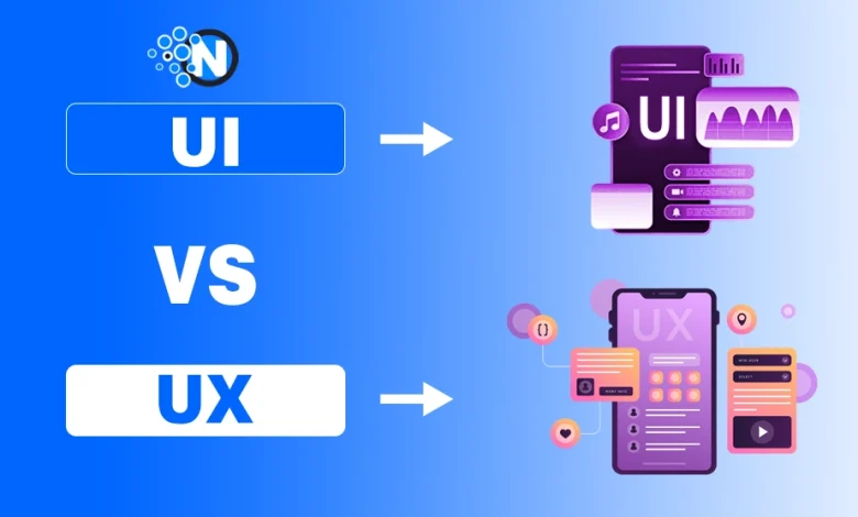
When we talk about UI (user interface), we’re referring to the tangible, visible parts of a product, the buttons you tap, the icons you see, the colours and typography, and the layout.
On the other hand, UX (user experience) is broader. It encompasses the entire journey: before you open the app, while you’re using it, and after you close it. It’s about how the product makes you feel, whether you trust it, and how easily you accomplish your goal.
UI and UX may sound like techy twins, but they’re not the same. UI and UX are two sides of the same coin. You can’t have a great product with just one. A beautiful interface (UI) won’t save a confusing experience (UX), and a seamless journey (UX) can fall flat if the visuals (UI) are clunky.

Why This Matters (Especially for Design Studios)
When you work in or with studios like those high-profile award-winning web design companies, this distinction becomes critical. Because your client might say: “Make it pretty.” But what they often mean is: “Make it work for our people.” And if you only focus on UI, the look and feel, you risk missing the core: how people actually use the thing.
In places like the best design agencies in New York, the tension is even more visible: speed, competition, brand image. UI gets the spotlight; UX often gets squeezed. Yet the teams that win build both, not perfectly balanced, but intertwined. Because when UI and UX align, you get both “ooh” and “ahh”.
Breaking It Down: UI Vs UX Key Differences
Here’s a table-style key differences breakdown to clarify:
| UI (User Interface) | UX (User Experience) |
| Visual elements: colours, icons, typography | Whole journey: onboarding → usage → exit |
| Layout, spacing, interactive widgets | How people think, feel, decide |
| Screen-by-screen micro-view | End-to-end macro-view |
| “Looks good / feels right on this page” | “Works well for me overall” |
For example, a button that glows on hover and matches brand style is a UI decision. Whether that button is placed where someone expects it, whether clicking it leads to a satisfying result, that’s UX.
Some Common Misconceptions:
- “UI is everything” – nope. You can create a gorgeous interface and still produce a terrible UX if users get lost, frustrated, or confused.
- “UX doesn’t need design, just research” – also false. UX uses UI decisions. But it adds layers: context, emotion, flow, meaning.
- “They’re interchangeable” – many people use “UI/UX designer” and assume the same skill set. But in practice, someone strong in UI might be weak in journey mapping or research, and vice versa. Knowing the difference helps allocate the right talent.
How They Work Together in a Project
In a well-run studio or design team (think: UI/UX design company), the workflow often looks something like this:
- User research & discovery (UX) – Who are the users? What do they need? What’s their behaviour?
- Information architecture & flow mapping (UX) – What are the tasks? How do users move?
- Interface sketches/wireframes (UI + UX) – early screens, layout of elements.
- Visual design & interaction details (UI) – graphic treatment, animations, branding.
- Usability testing & iteration (UX) – does it make sense? Are users stumbling?
- Final UI polish & hand-off (UI) – final styles, colours, assets for development.
If you skip UX early on, you may build a nice interface that simply doesn’t fit. If you skip UI polish, you may build something that works but feels cheap or unfinished.
My Own Little Story
I once worked on a mobile app for a lifestyle brand. The interface looked sleek: thin lines, minimalist icons, muted palette. We loved it. But when we tested it, users said: “It’s hard to tell if I’m done or not.” The icons looked too subtle, the spacing too large. We had focused on UI aesthetics without checking the UX flow.
We went back, boosted icon clarity, added micro-feedback after tasks, and adjusted spacing so the “Done” state felt done. The result: same brand look, but now people didn’t hesitate. They used the app instead of resigning. That’s the difference.
Why This Distinction Is Relevant for Decision-makers
If you’re a product lead, a startup founder, or a manager hiring a studio, ask both UI and UX questions. For example:
- For UI: “How will you ensure visual consistency across devices?”
- For UX: “How will you validate the flow we’re designing with real users?”
If a “UI/UX” studio only talks about colours and screens, you might be missing out. Make sure they also talk about journeys, context, research.
Final Thoughts
UI is the face of your product. UX is the feeling of using it. So next time someone says “UI/UX,” you’ll know exactly what they mean, and why it matters. You can have one without the other, but you’ll feel the gap.
When you bring both together, thoughtful UI built on grounded UX, that’s when users don’t just visit, they stay. They don’t just glance, they engage.
So the next time you hear “UI/UX design”, gently ask: “Which one are we talking about first?” And make sure the answer isn’t just “interface”. Because the experience behind it counts.