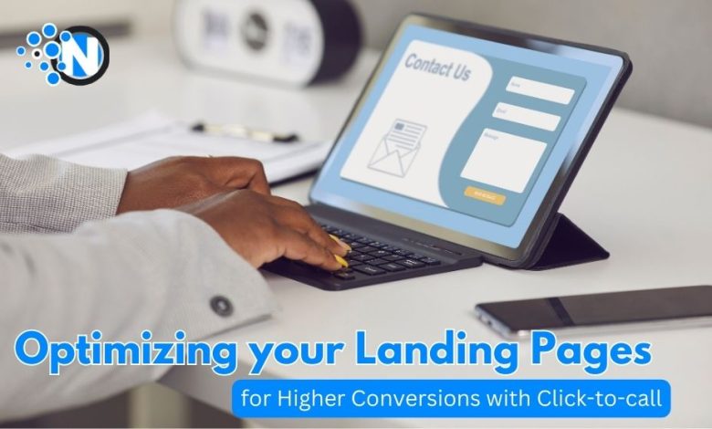
Imagine, you’ve put everything into making your website’s landing page look absolutely amazing. It’s got eye-catching visuals, it’s overflowing with cool info, and it lays out all the awesome stuff your product or service can do. But, right at the bottom, there’s this old-school form that’s like a big stop sign for your visitors. It’s asking them to jump through so many hoops just to say ‘hi’ to you. And let’s be real, who’s got time for that these days?
Now, here’s the superhero of our story: Click-to-Call software. It gives your visitors a magic button that lets them chat with you right away with just a simple tap. Forget about typing out your life story in a form or sitting around waiting for an email back. It’s all about getting you talking pronto. This little trick doesn’t just make things more fun; it actually gets more people to reach out.
Stick around me, and I’ll walk you through how this Click-to-Call Widget works and how you can make your landing pages super smooth and friendly for everyone stopping by. Let’s get started!
Understanding the Importance of Immediate Connection
Let’s accept it: in today’s busy world, we all value convenience. We want things to be quick and easy. We want answers fast, especially when we’re making decisions or looking to buy something exciting. Long forms and waiting around for email responses just don’t mesh well with our lifestyle.
The Click-to-Call widget turns your landing page into a hotline. If someone’s checking out your page, nodding along, but they’ve got a question nagging at them. A quick tap, and they’re talking to you, getting all the answers they need right then and there. It opens your door and welcomes them in for a chat. This kind of speedy talk can really bump up your sales numbers, especially if you’re in the biz of selling stuff that needs a bit more thought or urgency, such as real estate, healthcare, finance, and high-end retail.
Designing for Visibility and Accessibility
Now, if your call button is tucked away in a corner or at the bottom of your landing page, that’s a problem. It needs to be front and center, shining brightly. Here’s how you can make that button impossible to miss:
- Spotlight at the Top: Place that button right at the top of the page. It’s like saying, “Hey, let’s talk!” when someone lands on your site.
- Sticky Header: Alternatively, go for a sticky header. That way, the call button stays visible as they scroll, always there and ready for a chat.
And hey, ensure that the button is big and bold with clear labeling that indicates the immediate benefit of clicking, such as “Talk to an Expert Now” or “Get Immediate Assistance.” It should be easy to spot and tap on any device, not just a computer website. A splash of color that stands out? Even better.
Streamlining the User Experience
Your landing page is like your home’s front porch. You want it to be welcoming, not a maze. So, for the call button, think easy:
- Clean and Tidy: Keep things neat. If there is too much going on, your visitors might miss your call button or get lost in the clutter.
- Swift Speed: Make sure your page loads fast. No one likes to wait (as I said earlier), and you don’t want them bouncing away before they even see what you’ve got.
And when they hit that call button? Don’t make them fill out a novel. Just a quick question: “What’s your name?” and “What’s your number?” That’s it. The less hassle, the more likely they’ll reach out. So let’s keep it friendly and fuss-free, alright?
Personalization and Reassurance
Do you know how a plain old “Contact Us” button is kinda like getting a “Hey” text? It’s cool, but it doesn’t really show you care. Now, think of a button that’s more like a personal invite, saying something like “Let’s Talk Fitness Goals!” It’s way more inviting, right?
If you’ve been eyeing that healthy eating guide on the site, wouldn’t it be awesome to have a button that’s all “Get Your Free Nutrition Chat Here”? It’s like the site knows you’re into greens and grains and wants to help you out. That’s the kind of personal touch that makes folks wanna click and talk.
Trust is huge, too. Nobody wants to drop their number into the void. So, when you say, “We’ll ring you back in 5,” it’s like making a pinky promise they can count on. And a little note saying, “Your secrets are safe with us,” goes a long way to show you’re not gonna spam them or do anything shady with their info.
Leveraging Analytics and Testing
So, you want your landing page to be the talk of the town, and that callback button is your secret weapon. But how do you know if it’s hitting the mark? Keep an eye on how many people are clicking that call button, how many chats turn into deals, and whether certain things on your page are making folks more click-happy.
And here’s where you get to play mad scientist with A/B testing. Mix it with different spots and styles for your button and see which one gets the gold star. Test it out, check the stats, and keep nipping until your landing page is smooth. Keep it fun, keep it smart, and watch those conversions climb!
Integrating with Other Tools
Although the callback button is the star player of your team, it needs a solid crew to back it up, right? That’s where tools like CRM systems come into play. CRM systems keep track of everyone who wants to chat with you. Did you miss a call? No problem. Your CRM buddy has it noted, and you can call them back without skipping a beat.
And then there’s automated scheduling. It’s like having a personal assistant who sets up calls when it works for you and your customers. No more ping-pong emails to find the perfect time. This dream team ensures everyone feels heard and valued, and that’s what keeps them coming back.
Addressing Mobile Users
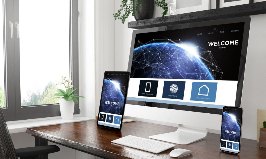
Now, we’re all about our phones, right? So, if your landing page is a nightmare on a smartphone, that’s also a big no-no. You gotta make sure it looks good and works well, no matter the screen size. That’s what responsive design is all about. It makes everything fit just right, whether on a phone, tablet, or computer.
Make sure scrolling your page on the phone is a breeze. Big, easy-to-hit buttons and simple menus are the way to go. And that call button? Make it mobile-friendly so one tap is all it takes to get connected.
Continuous Improvement Through Feedback
Last up, let’s talk about keeping things fresh. You’ve got the cool callback feature, but is it hitting the mark? The best way to find out is straight from your users. After they use the call feature, shoot them a quick email or pop up a survey and ask what’s up. Was it easy to find the button? Did they get a call back quickly enough?
Listening to what they have to say helps you make the callback experience even better. And when customers are happy, they stick around. It’s all about making those connections count.
Conclusion
Alright, let’s wrap this up nicely. We’ve been talking about that instant connection everyone’s after, and Click-to-Call is your golden ticket. It’s like rolling out the welcome mat for your visitors, inviting them to chat right away. We’ve explored all the cool ways to make your landing pages more inviting with callback, ensuring they are easy to find and use and fit seamlessly into the flow. Remember, listen for feedback, and you’re good to go. Give these tips a try and see how your connections with potential customers blossom into real conversations. You might be surprised by how much closer you get to your audience. Now, go ahead and give it a shot!